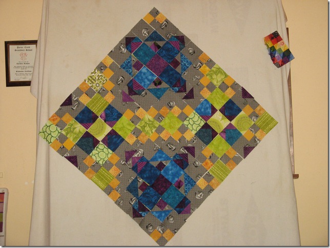
I decided that before I went any further with making decisions about what fabrics to use where and cutting up a bunch of pieces, that I needed to set up two more blocks so I could really get an idea of the design. Am I ever glad I did that!
I now understand which way the four patches are supposed to turn and I see that changing out the greens that I was thinking of just won’t do because it interrupts the chain.
Here is what it looks like with the dark grey and the greens…
I did conjecture that if I want to tone down the green a bit, the way to do that would be to change out the four patch greens in the top and bottom block. They would have to be changed to blue because there is already a lot of purple going on there. This is what it looks like with that change…
What do you think? I’m thinking that the blue makes it too dark.
I was going to try it with the light greys as well, getting rid of the medium grey that I incorporated in the mix altogether.
But I would have had to unpick, cut and sew and I had enough for this evening. I may try that tomorrow.
Janet


I like the first picture the best. The blues are too dark. Now that i've seen mine in Bonnie's colors..and love it.. I have the courage to try another color palette.
ReplyDeleteI don't know how you can make those decisions not knowing how its going to finish up? It goes right over my head!
ReplyDeleteI dont like the all blue blocks. I like the top pic,but like you say, there is something off. I think it might be that the blue and purple look too blended. To close in tones maybe..
ReplyDeleteI agree with Jo, the greener version looks fresher and brighter, not that I dont like the other one, so much work is in this.
ReplyDeleteNow I can see why you are staying with the greens..
ReplyDeletePLease don't do the blue block - stay with the green.
ReplyDeleteI will say make it dark gray even if that means upicking (I mean you can always just not do it). But I'm one of those people who always look for order in the chaos, and the dark gray just makes it clear where the "nice blocks" and where the "filling" is ... it sort of clams the whole thing down a bit.
I like the light grays!! (looking at the upper left block of the bottom pic) What a bummer that that would involve the unpicking. They really let the blues and purples sing together instead of getting lost in the value level of the darker grays. They'll give your quilt much more dimension as a whole top.
ReplyDeletePersonally, I like the greens because they tone down the golds. The blue version makes the gold more prominent and somehow just seems to unbalance the design. I'd try four blocks with the light gray to get a better feel for the whole before committing to that. Just my two-cents.
ReplyDeleteI think the green is fine, the blues do look a tad dark ,so I would go with the first version in these photos .
ReplyDeleteI agree witf the comments. Keep the green at the top. I like it.
ReplyDeletelooking good... I also prefer the look with the green...
ReplyDeleteHugz
I'm loving the drama of the dark blue blocks - it just seems to make the pattern 'pop' as well.
ReplyDeleteI like the first one with the green instead of blue~
ReplyDeleteMe, I'm lazy. I vote for NO UNSEWING! Either way, the quilt will be lovely!
ReplyDeleteI love your color choices. I think the darker background really shows off you fabrics. I like your first block the best. Can't wait to see the finished project.
ReplyDeleteI have to agree...keep the green. Like the top photo best...
ReplyDeleteI like the greens and lighter greys. There is loads of sewing in this but it's totally worth it. Good luck with your decision.
ReplyDelete